Redesigning LinkedIn’s Global Editorial Tool
Product Design
Tooling
Role
Design Lead
Timeline
Aug - Nov '22
Partners
Designer, Product Manager,
6 Engineers
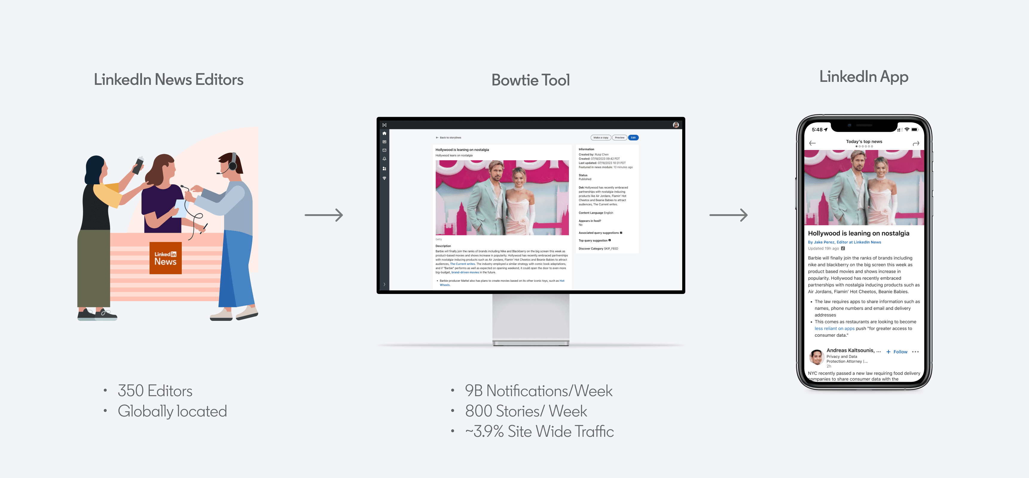
Bowtie is LinkedIn News' internal tool used to craft news stories for LinkedIn's consumer app. Our team redesigned the tool to optimize editor's workflow, empowering them to work more efficiently and effectively.
DISCOVERY
Meet LinkedIn News' Editors
A team of 350+ LinkedIn News Editors around the world curates and creates professional news content to keep LinkedIn users informed, on the daily. Their responsibilities include:
Curating timely news across various industries (e.g., Fry's Electronics going out of business).
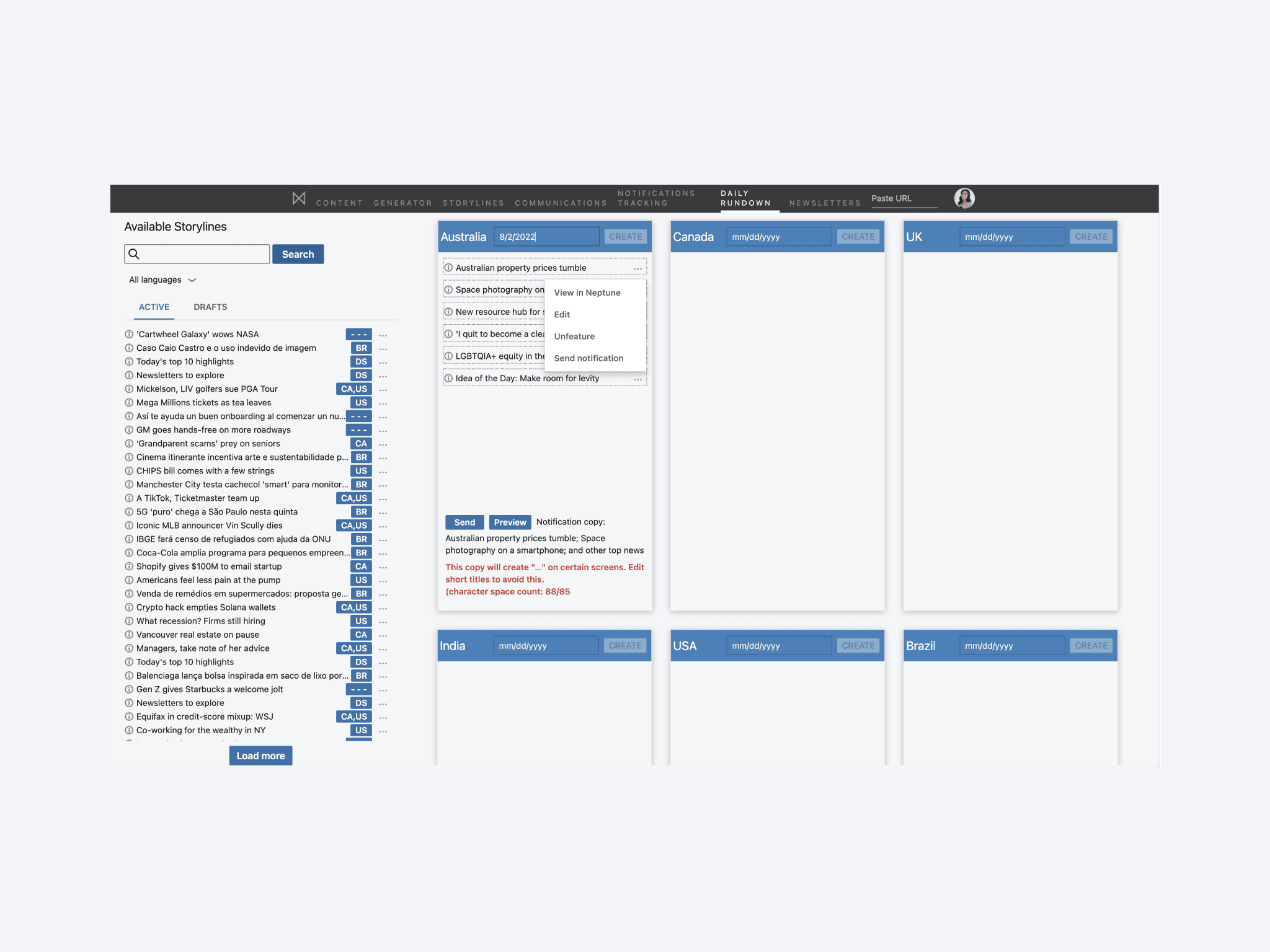
Using Bowtie to build and manage new stories, collections, and notifications for targeted users.
The editorial workflow + issues
Bowtie’s legacy design, developed by multiple teams without design guidance, was generally disorganized and unintuitive. To understand the editorial team’s needs, we conducted extensive interviews and created a journey map to identify pain points.
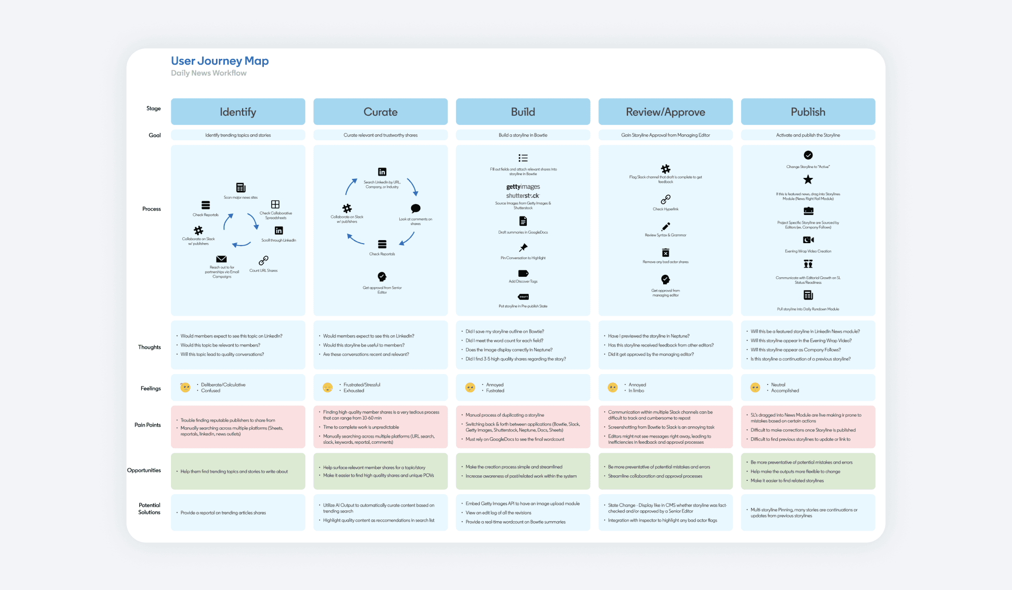
The key pain-points where around the creation stage for the team. Because of this, our team focused on this area as a prioritization area. The key issues around this was:
Bowtie was not aligned with editors' workflow, leading them to use tools inefficiently.
Navigational hierarchy was unclear and made finding information difficult and unorganized.
Errors were easy to make, requiring rigorous checks to avoid public damage to their reputation
OPPORTUNITY
How might we transform Bowtie into an extension of the editorial team, where clarity and precision minimize errors and integrates seamlessly into their existing workflow?
DESIGN
Brainstorming For Team Alignment
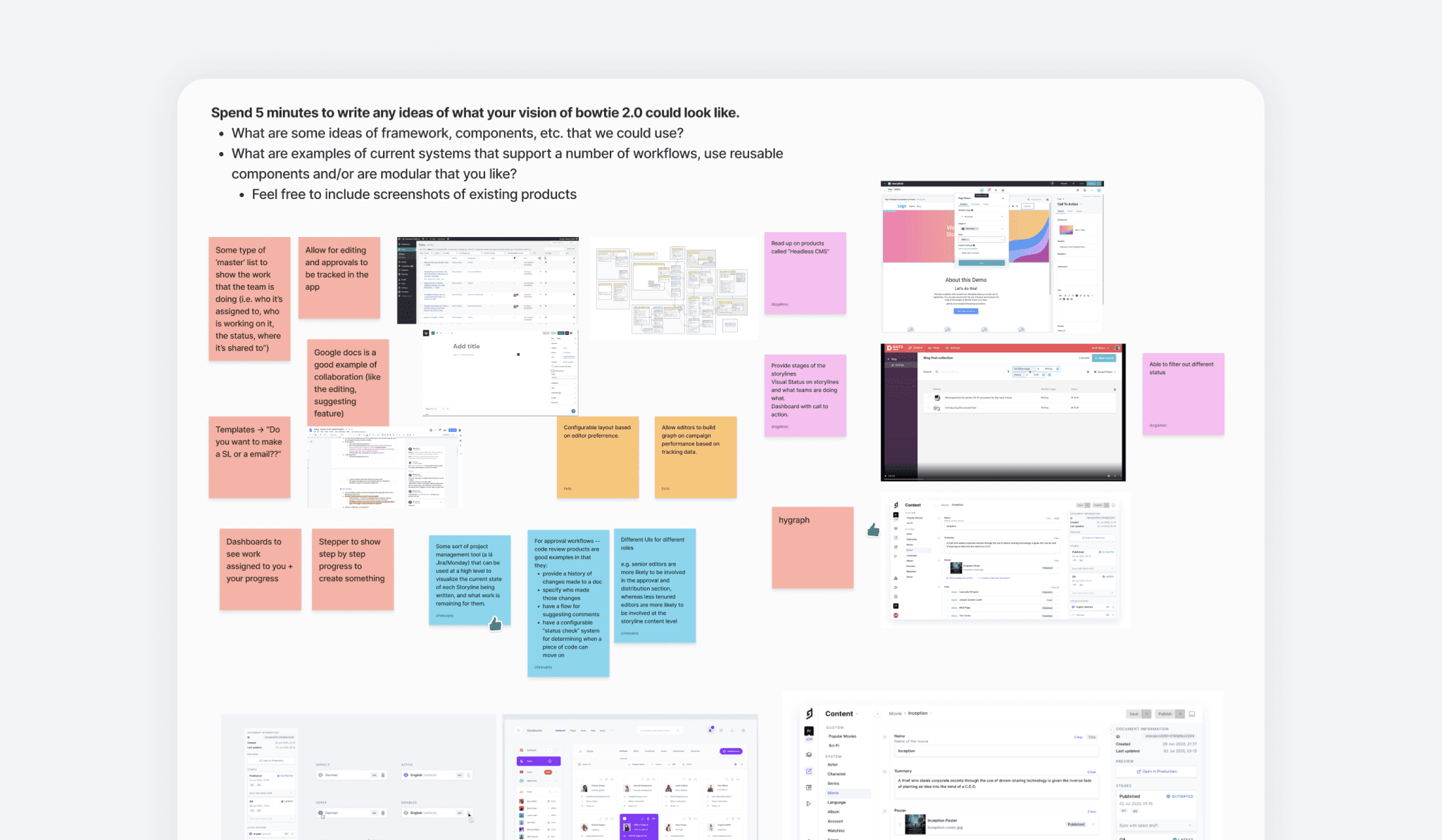
I led a brainstorming session to align our product and engineering teams on high-level goals. This session resulted in a unanimous understanding of what we wanted to achieve with the project.
Optimizing Information Architecture
We then focused on restructuring the pages and navigation. The existing foundation was confusing and didn’t meet the editors' expectations. By consolidating related features and tasks based on editor workflows, we enhanced the tool’s organization, making content discovery more intuitive.
Audit of the existing experience
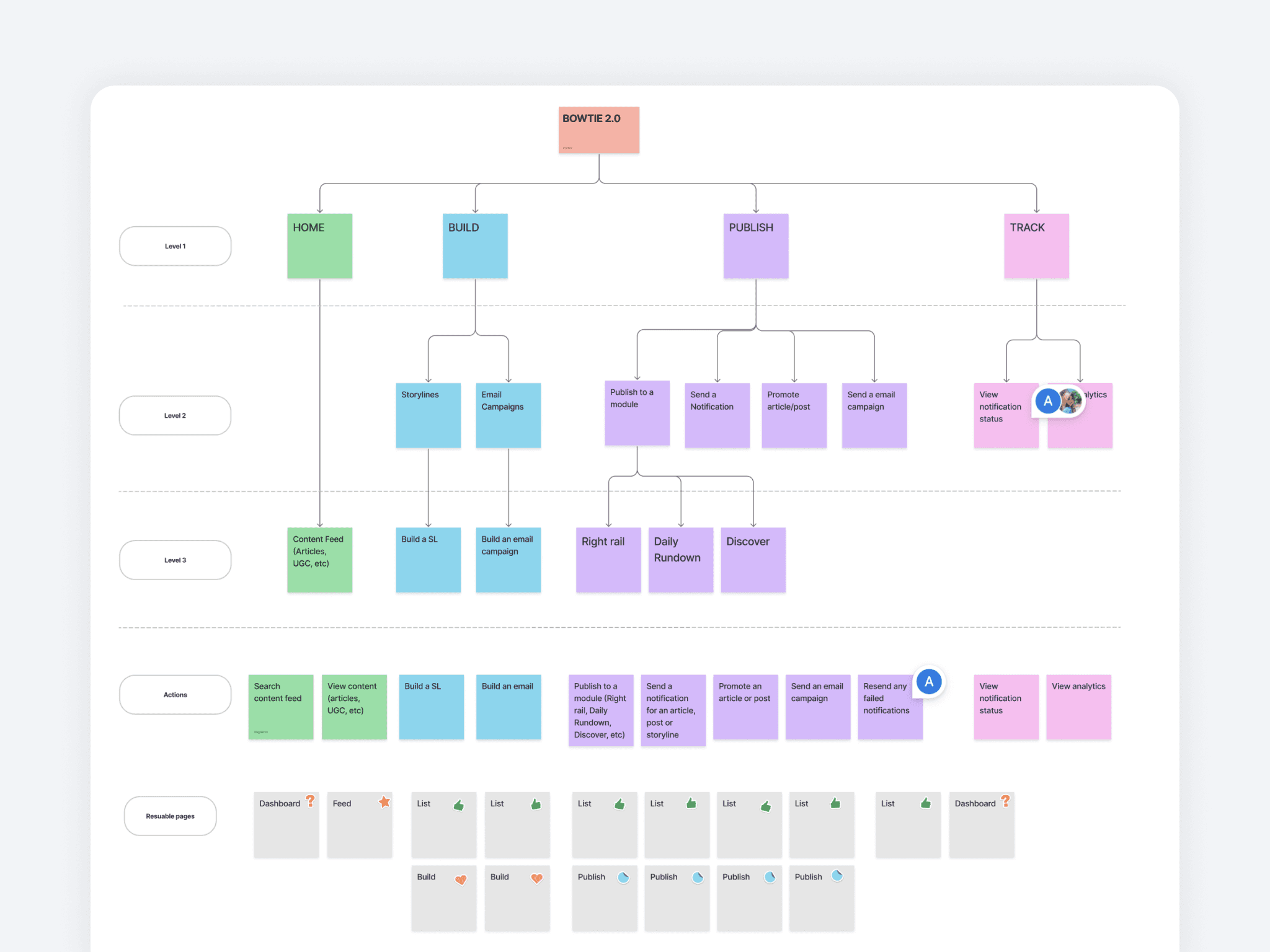
New IA proposal to simplify the structure
Crafting Designs
We started with low-fidelity wireframes of the end to end creation flow. To ensure early editor input, we used Google Slides to collect asynchronous feedback on proposed designs. This approach allowed us to present user flows and gather insights and concerns from editors worldwide.
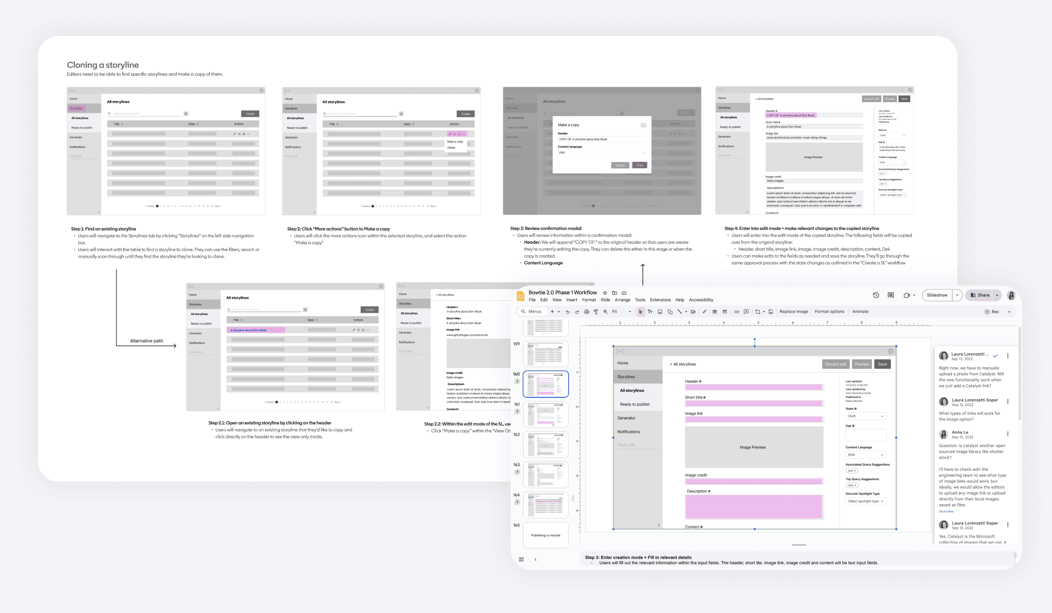
We used design system components to quickly assemble an MVP solution. For unsupported components, we provided custom styling to ensure a cohesive and unified UI.
FEEDBACK
Usability Testing
Using our end-to-end prototype, we conducted usability studies with global editors to evaluate the three new experiences in Bowtie—creating, publishing, and copying stories. Our goal was to determine if the new design effectively supported their daily workflows.
Our research helped us identify user challenges and prioritize design iterations within these categories:
TERMINOLOGY CONFUSION
Editors struggled with the navigation labels and some input field names.
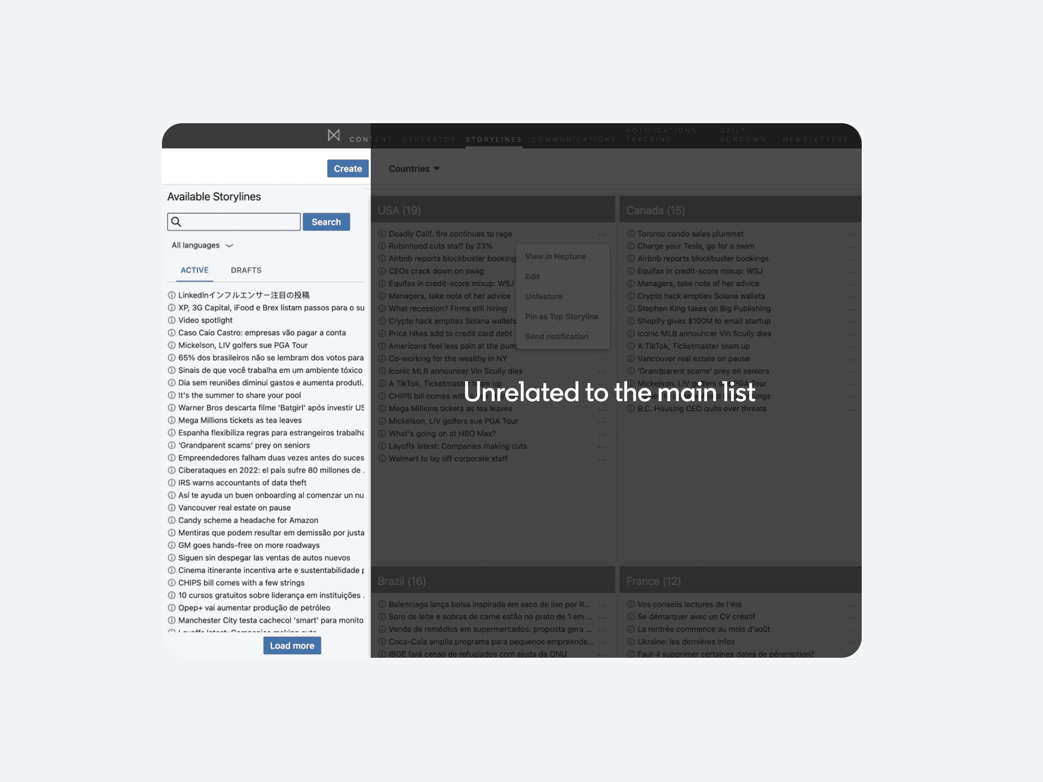
Editors noticed challenges in distinguishing copied stories across different geographies
UNUSED WORKFLOW
FINAL
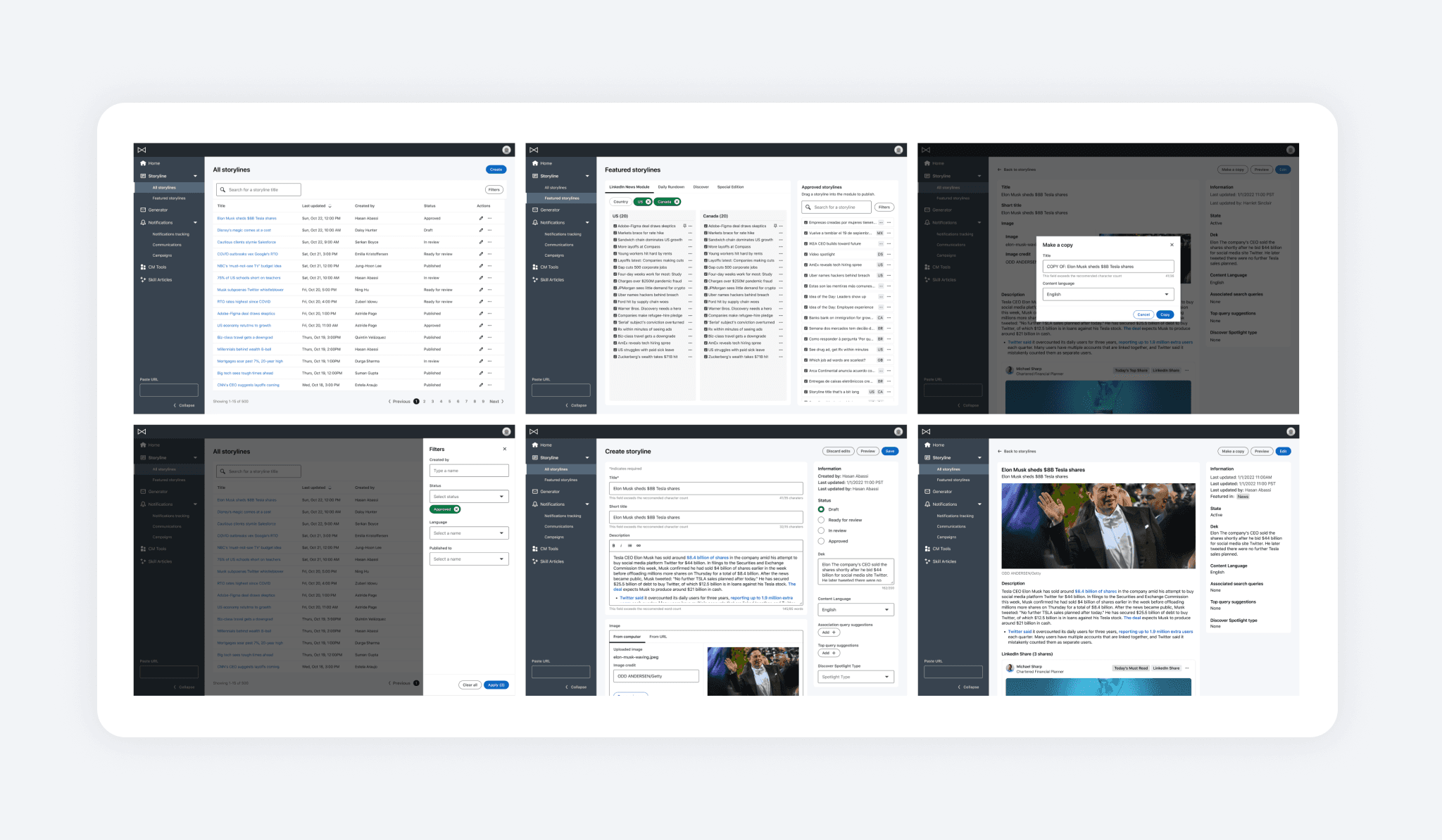
Final Solution
By addressing key pain points, we greatly enhanced the tool's efficiency in our end solution. Editors reported that these changes were among the best improvements they'd experienced, boosting both efficiency and morale. Below are the key changes:
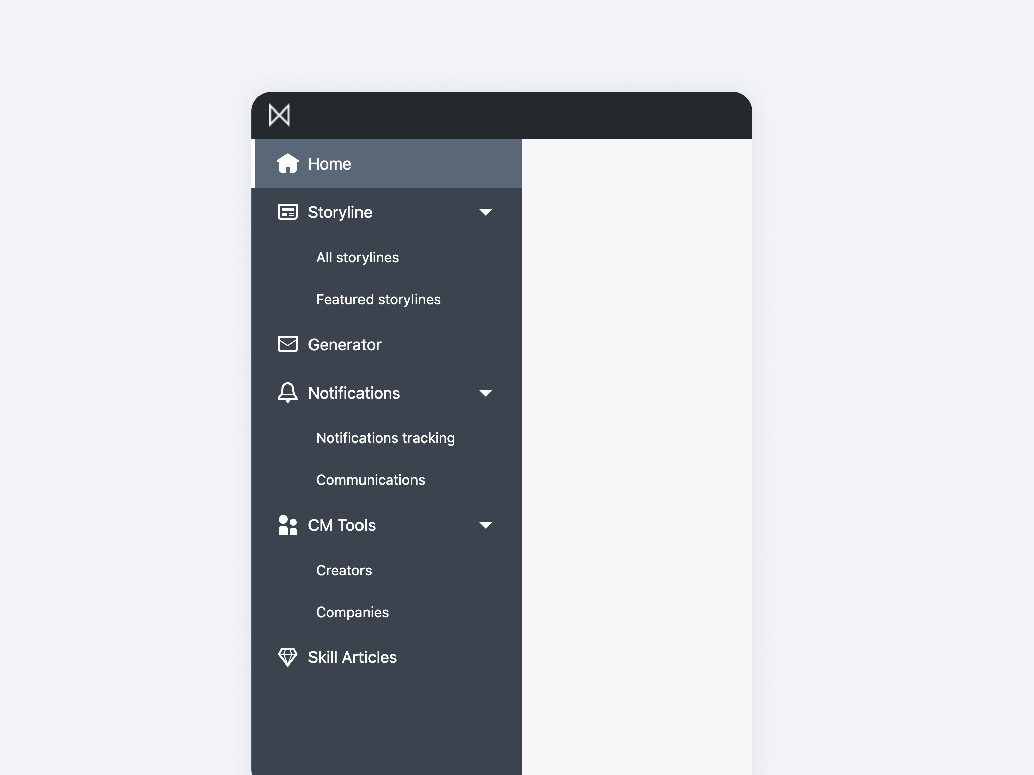
Clearer Navigation and Page Hierarchy
We implemented a collapsible left panel navigation for scalability, organizing elements into parent-child groups and adding icons for clarity. Deprecated features and dead-end pages were cleaned up from the nav.
BEFORE
AFTER
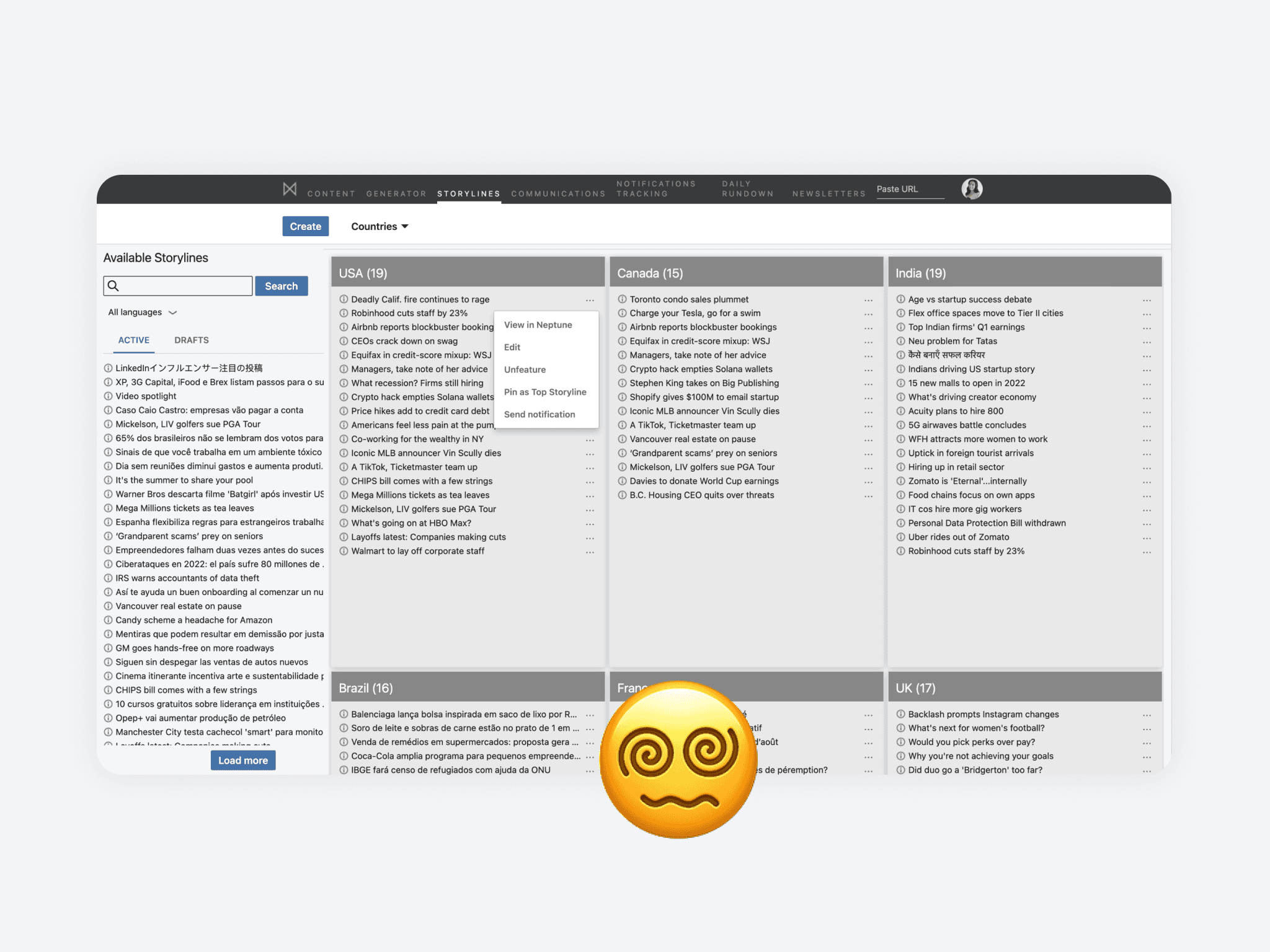
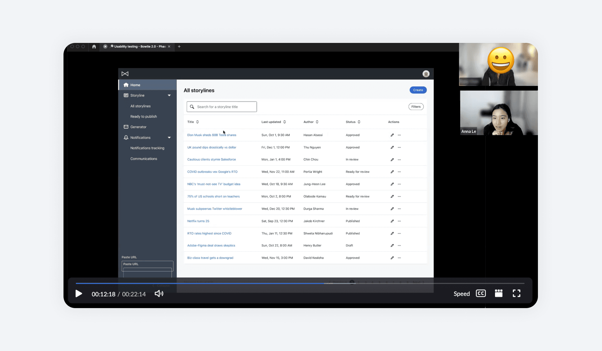
Simplified for Focused Views
Previously, the team used a cramped side panel with no grouping, filtering, or context for stories. We redesigned it into a full-page list, providing editors with the space and information needed for better decision-making.
BEFORE
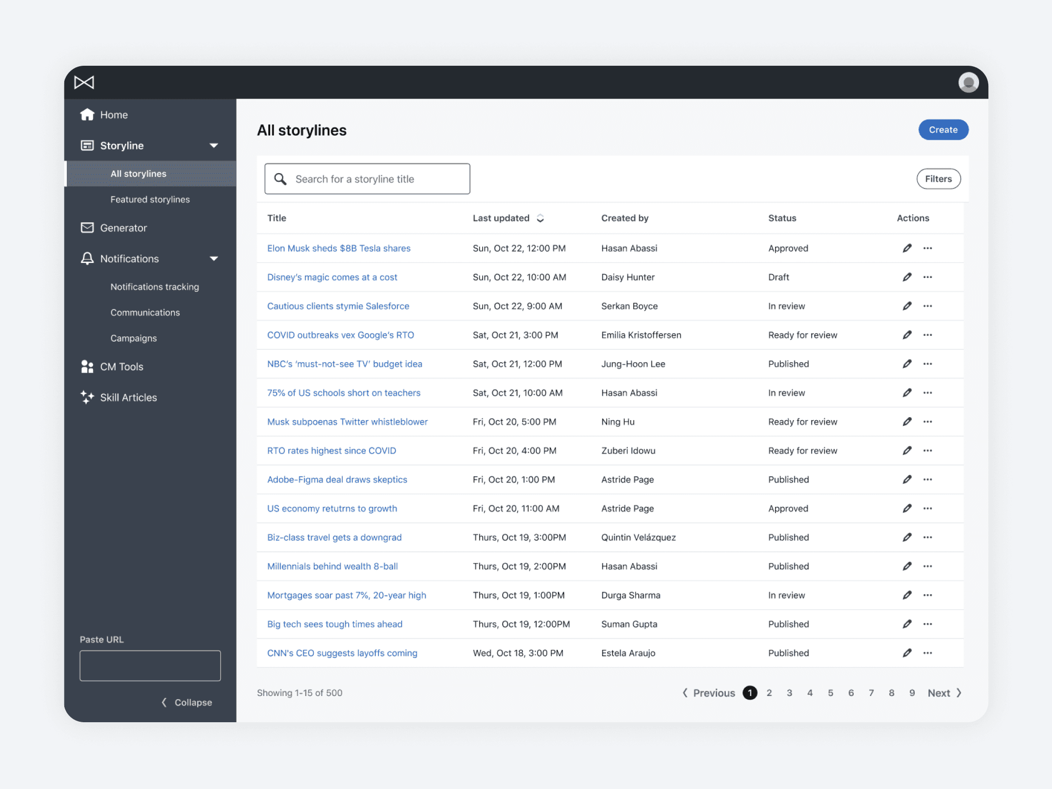
AFTER
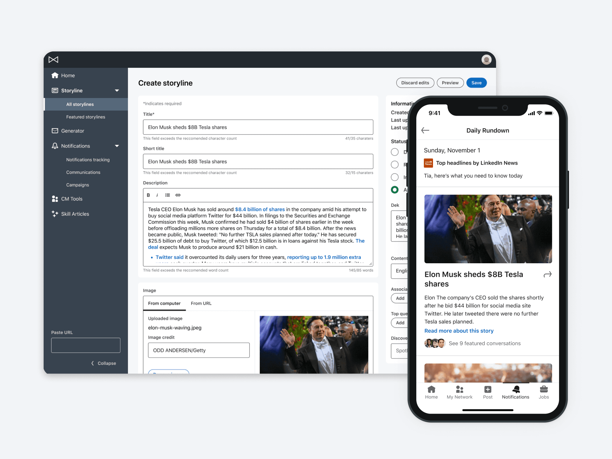
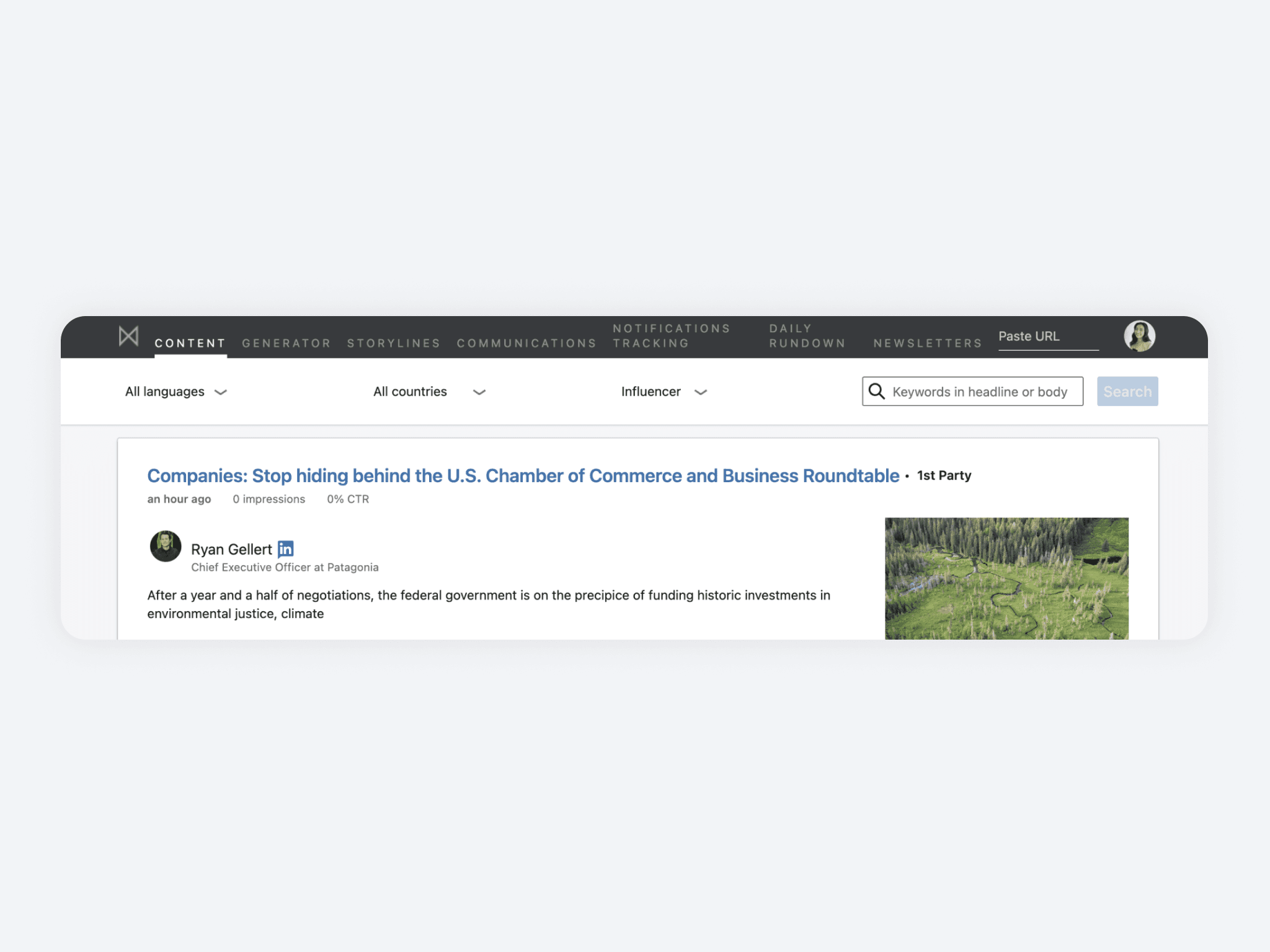
Aligning Creation Structure with Output
We redesigned the story creation page to mirror the LinkedIn story format, ensuring a clear alignment with the final output. Additional metadata, such as the creator, last update, and a status panel, were added for improved tracking and smoother work handoff.
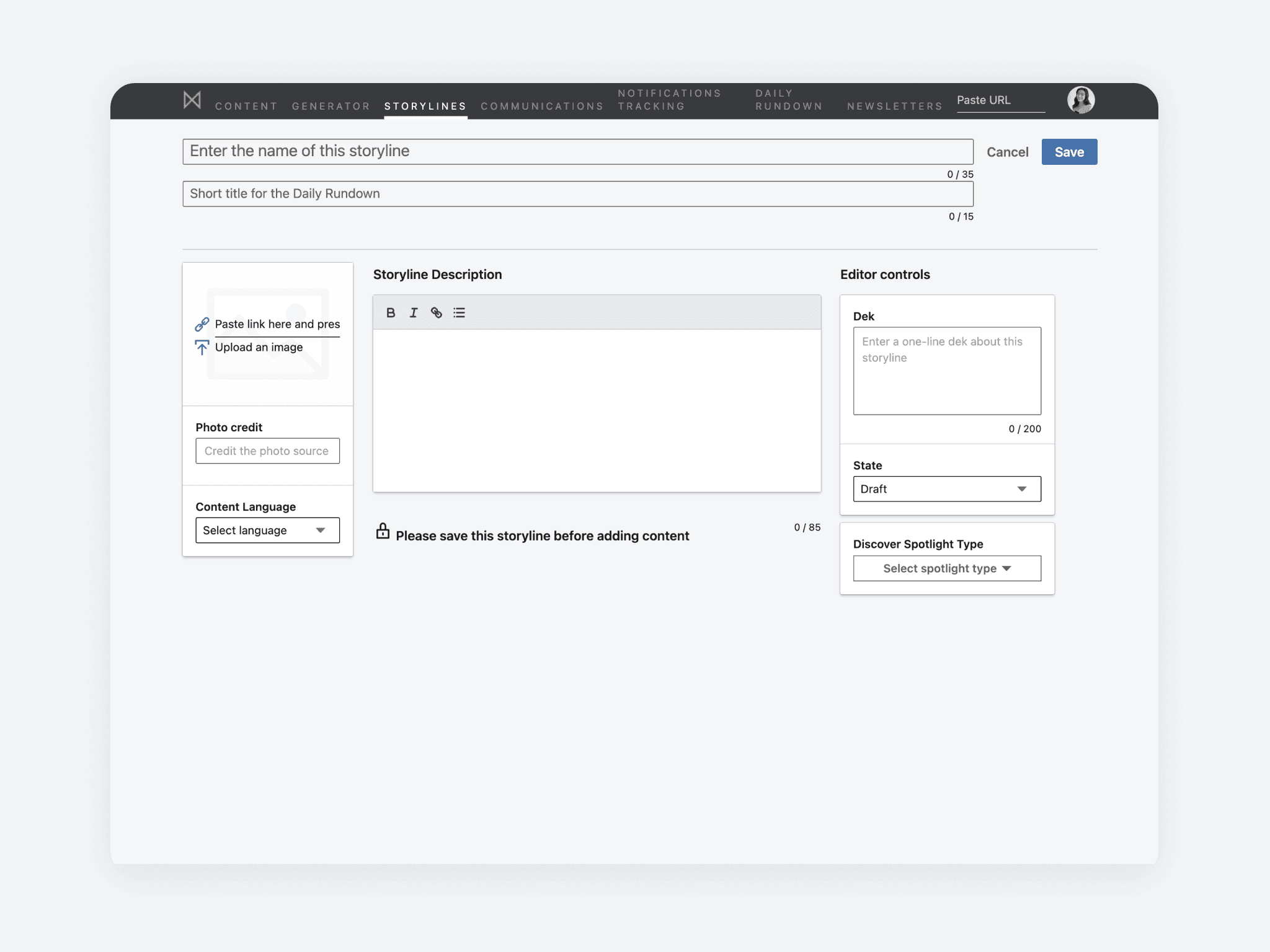
BEFORE
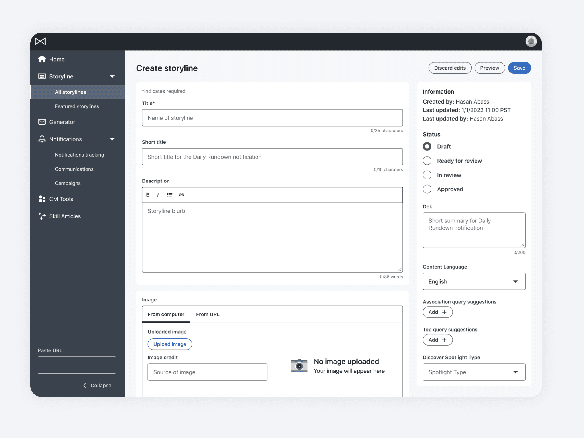
AFTER
Signals and Error Prevention
We implemented protective confirmation and error states to help editors avoid mistakes. Although fundamental to the tool, auditing and integrating these safeguards enhanced system trust, enabling editors to work more seamlessly.
BEFORE
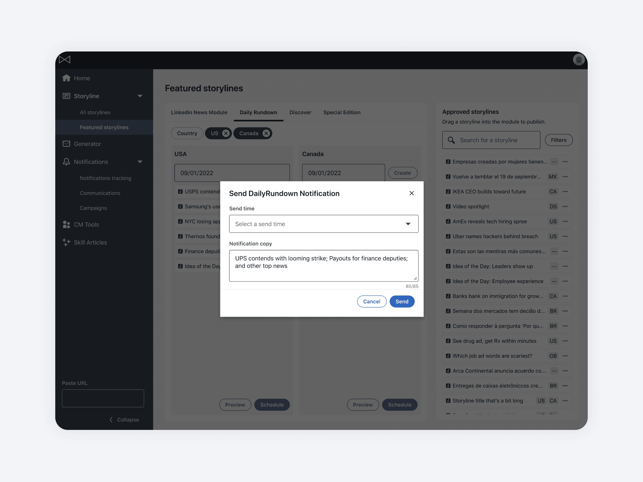
AFTER
Lessons learned
Designing Globally
I learned to design with international scalability in mind, ensuring that requirements for different locales are met effectively.
Balancing Stakeholder Needs
I improved my ability to work with internal stakeholders by balancing product efficiency with their needs. Prioritizing issues effectively within time constraints is crucial for addressing both user and stakeholder concerns.
Holistic Prioritization
In hindsight, focusing on the notification flow before the creation flow might have been more beneficial. I learned to advocate for and address high-risk areas early on and to consider workflows holistically for better decision-making and long term impact.
End of case study.